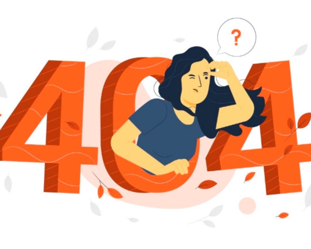
Bumping into the 404 page has certainly happened at least once to everyone. These pages are used to warn the visitor that the page they were looking for no longer exists or has been moved. You may be taken to this unfortunate section due to a typo or simply because the content you were looking for does not exist.
Normally, or rather in most cases, the user, having landed on this page, exits and abandons the site: a waste of time to wait and try again.
Still, why not turn that mistake into a marketing opportunity?
This page is not always a bad or malfunctioning example. It is increasingly common to use it creatively to attract users’ attention to create engagement and keep visitors on their website.
In short, it can undoubtedly become the opportunity to communicate information in a completely original way.
Therefore, improving your Error 404 page is an effective method for not making the user feel lost within a section of your website. Optimizing it must be done to prevent the user from abandoning and never returning to browse it. The technique uses captivating graphics and an interaction model that allows you to be remembered in an original and fun way.
If you don’t know where to start creating an error page, you can start from these examples found “by mistake” online.
Also Read: Digital Trends 2021: The Top 5 Trends Not To Be Missed
Pixar
“Awww … don’t cry!” Pixar focuses on feelings and emotions. In short, we have come across an error page, but there is no need to make a drama out of it.
Figma, Sector:Design
The creativity of Figma, a company that deals with digital design, is unique and reflects strictly its core business, precisely design. The user who mistakenly happens to be on this page finds himself in front of a vast 404 that he can freely remodel. Seeing is believing!
Oreo, Sector: Food
“Oops, it looks like someone ate these virtual cookies. Can you blame them? Click here and go back to surfing. “In this case, the idea is that the cookie that served as 0 was so good that those who passed by couldn’t stop themselves from devouring it.
Maxxi, Museum of Art (Rome)
CDIV: Were you missing 404 in Roman numerals? Here it is (and it is used by those who know about historical eras).
Barilla, Sector: Food
Okay, in this case, we were wrong, and we typed something wrong, but here Barilla comes to us with sympathy: “Oh no! This plate is empty!” and scrolling the page, you can choose where to navigate: Home Page, Pasta, Sauces, Flours and Cereals. In short, at lunchtime or not, everyone gets their mouth-watering and the desire to continue browsing their website.
La Tiperia Restaurant (Rimini)
It is easy to get lost in the woods of Montefiore Conca, torture, then find your way back if you are hungry. The restaurant makes fun of the difficulties encountered when you really look for the right way that leads to its refreshment point, and it does so by reassuring the user and showing him the way back (link to the Home Page).
ViaggiareInPuglia, The Official Website Of Tourism In Puglia
The official page of tourism in Puglia plays on the splendour of its landscapes: a horizon at sunset, a calm sea, in short, too much beauty, and you can get lost. Back to Puglia and then to the Home Page.
Mailchimp
Mailchimp is characterized by hundreds of stylized illustrations that fill every section, even in this case, when you misspell a search word or the page has been moved, you land on this cute corner of the site where a strange animal is looking in. something far and wide, perhaps your page. And once again, it was sent back to the Home Page. Why did we find this page? Well, don’t you know that we are Mailchimp certified, and we know it very well?
Mulino Bianco , Sector: Food
Lots of information and many links to other pages. The error almost becomes a reason to find the shortcut to what we are looking for. And so, in this way, excellent interaction with the visitor is created, and the page can also be used as the access resource par excellence to other sections.
Strava, Sector: Sport
A red light. Strava chooses a “road” sign to indicate something is wrong, blocking the user and forcing him to stop.


